McDonald’s Branding
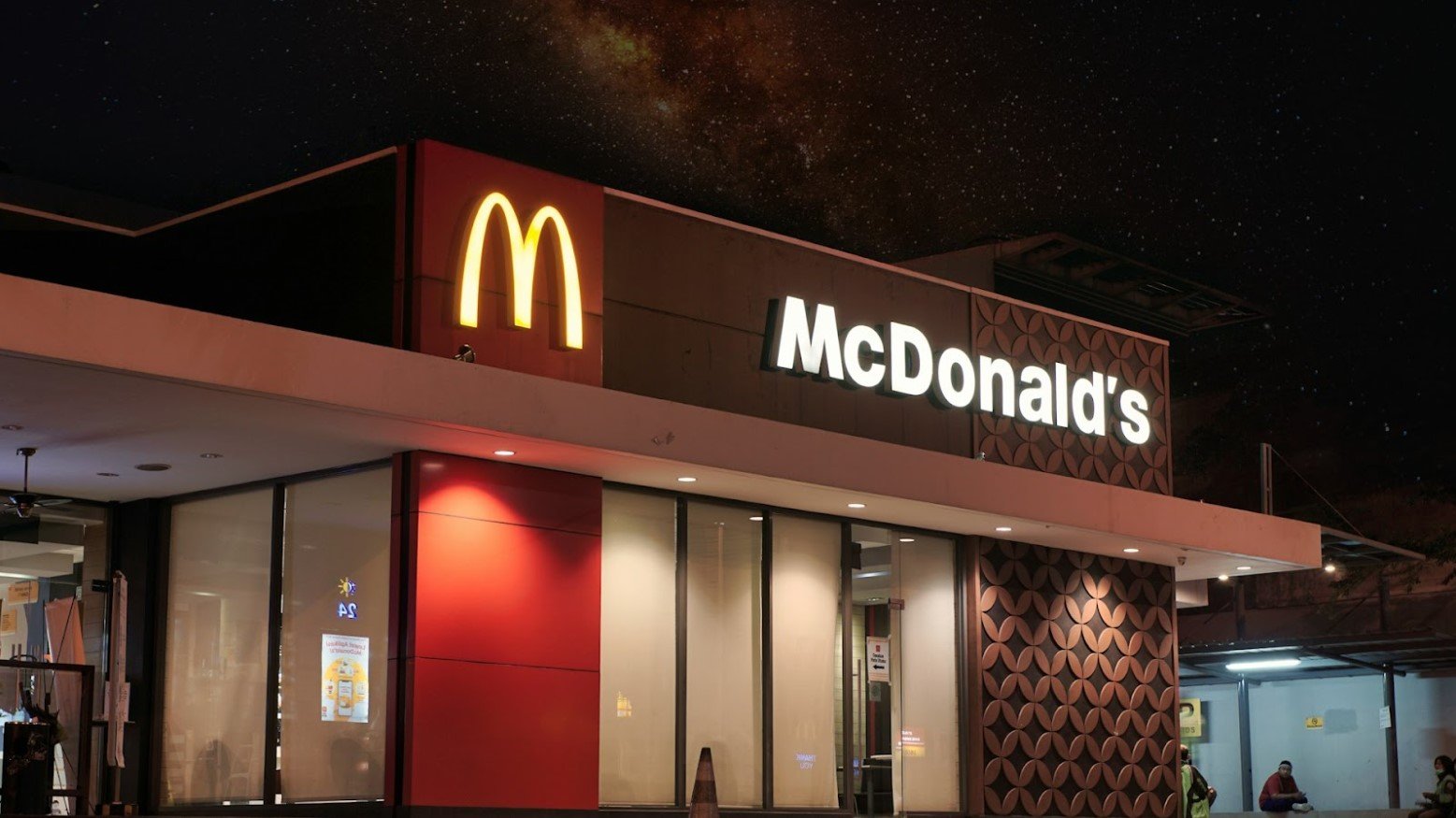
One of the keys to the success of McDonald’s as a franchise is consistency. The popular fast food chain has worked hard to make sure that customers know they’re getting the same thing when they go into a restaurant anywhere in the country.
Source: Visual Karsa/Unsplash
You know what to expect. The menu will be practically the same in every restaurant, and items will have the same name — a Happy Meal is always a Happy Meal.
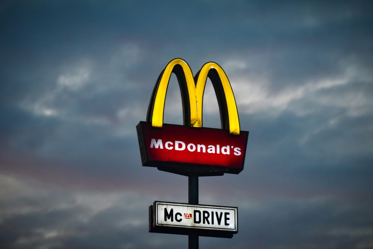
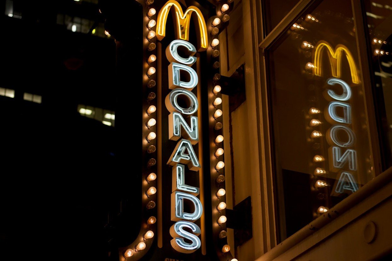
The Golden Arches
Part of this consistent brand identity is the iconic golden arches. This design can trace its origins all the way back to 1952.
Source: Jurij Kenda/Unsplash
Initially part of the building design of the first McDonald’s restaurant, the arches were incorporated into a logo for the chain designed to resemble a stylized McDonald’s restaurant, before becoming the instantly recognizable golden “M” logo in 1968.
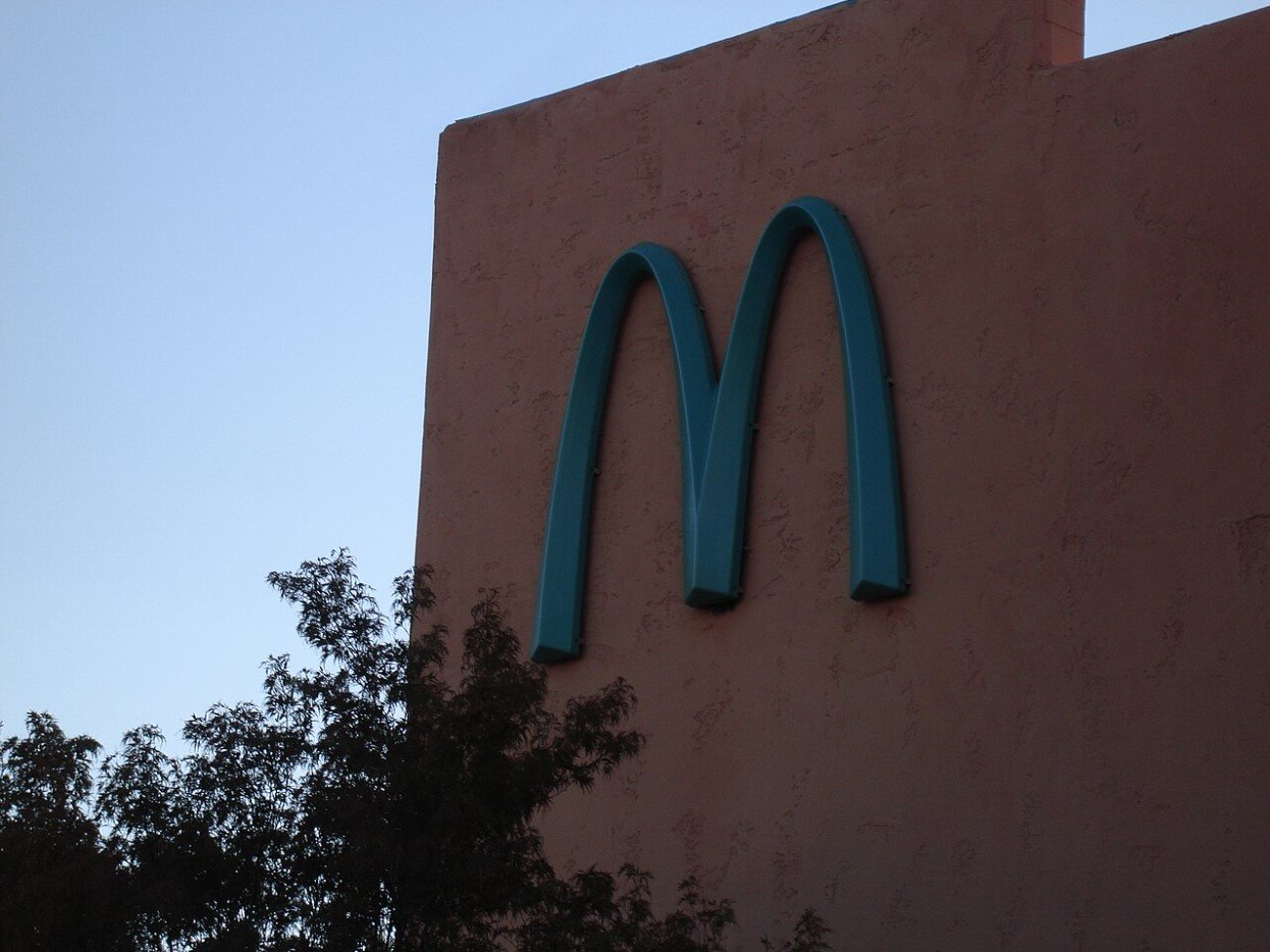
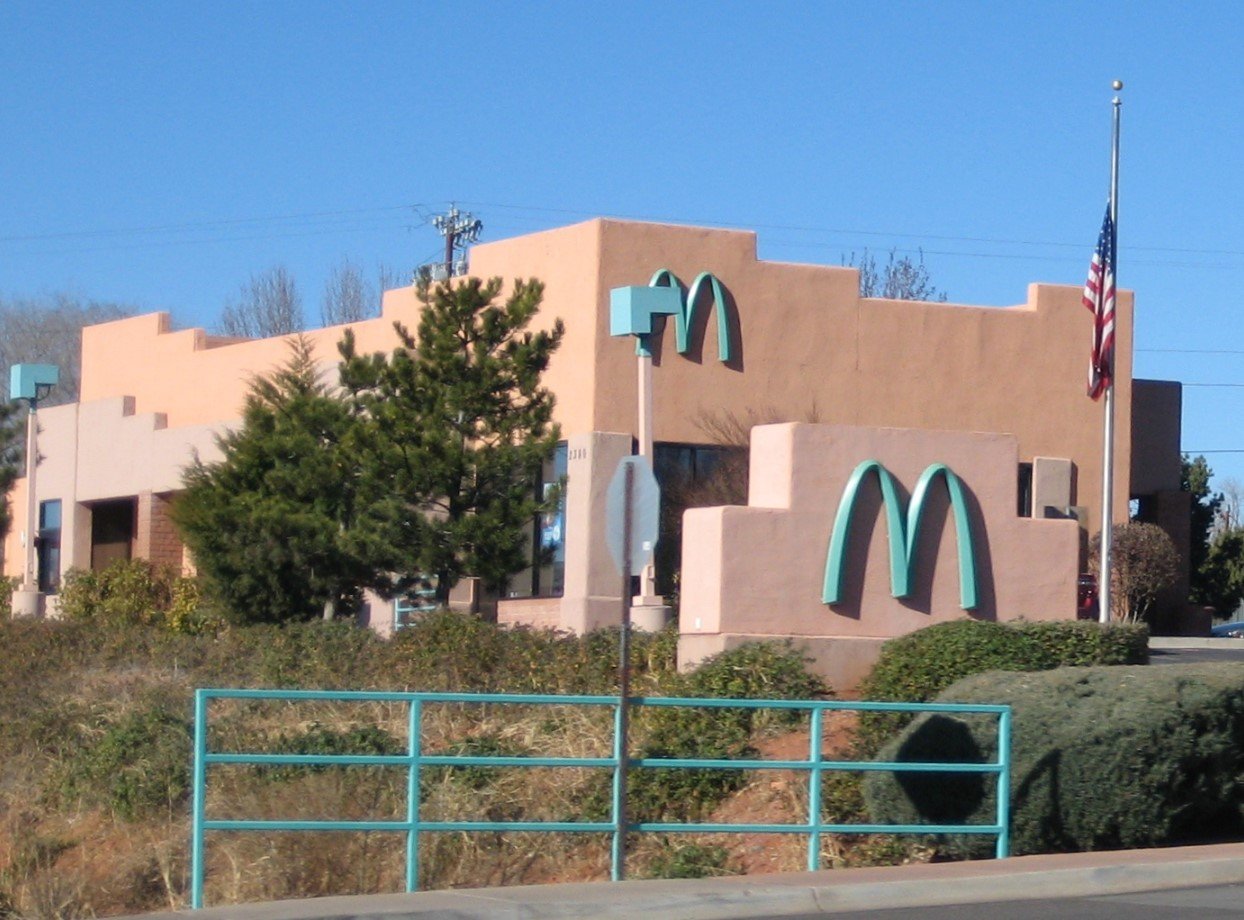
The Turquoise Arches
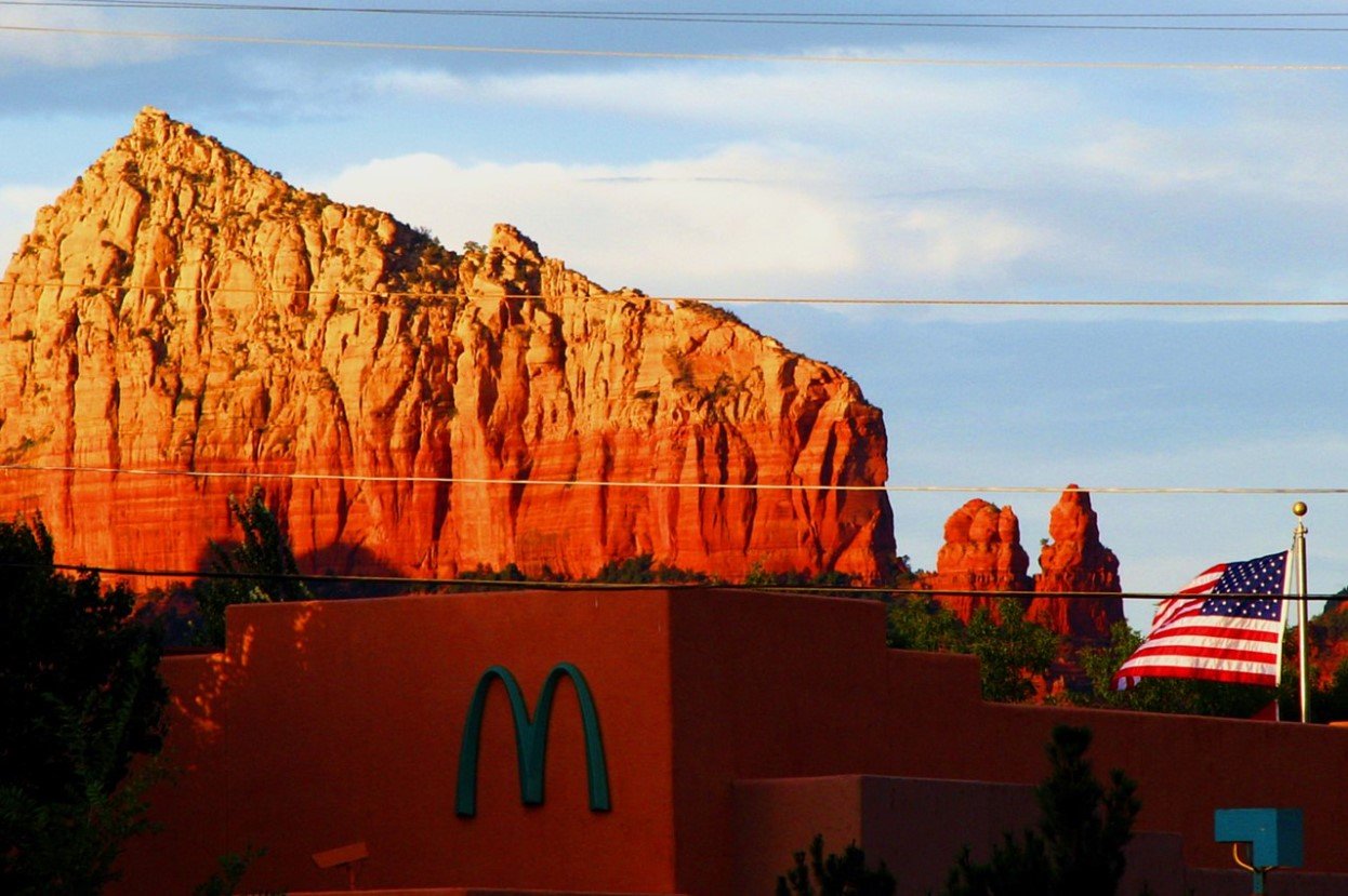
With predictability at the core of McDonald’s brand identity, any deviation from the norm is notable. So many customers are understandably surprised to find a restaurant that has ditched the “golden arches”.
Source: midiman/Wikimedia Commons
The McDonald’s along Highway 89 in Sedona, Arizona, sticks out as it welcomes customers with a turquoise “M” logo, ditching tradition.
The Sedona Restaurant
Go inside this outlier restaurant and it is still very much McDonald’s. The menu is exactly what you’d expect; there are no surprises there.
Source: Christian Wiediger/Unsplash
Photos of the interior show it looking like any other restaurant, with the usual McDonald’s branding on all signage in the expected colors. So, why the deviation outside?
Sedona’s Natural Beauty
The reason is clear if you ever visit Sedona, Arizona — it has a strikingly beautiful natural landscape. And city officials know it.
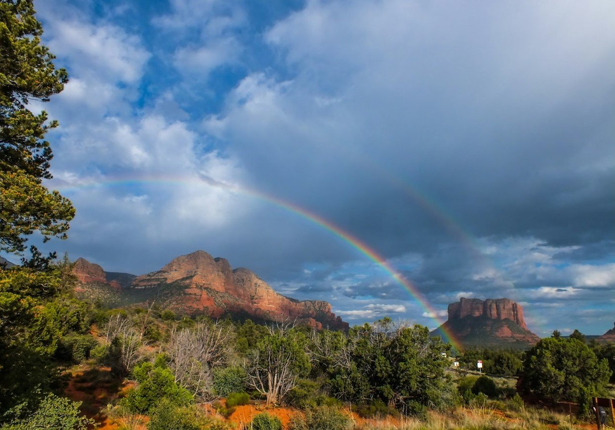
Source: Emir Dagci/Unsplash
Sedona officials push to have all buildings “blend into the natural landscape” as much as possible to protect this natural beauty. It’s for this reason that the McDonald’s on Highway 89 is unlike any other in the country.
Blending in With Nature
McDonald’s worked with the city of Sedona to make sure the restaurant wouldn’t look out of place among its picturesque surroundings.
Source: Wikimedia Commons
The iconic McDonald’s logo both on the highway and on the side of the building is turquoise with no hint of the brand’s usual yellow motif to respect the city’s wishes and help preserve the natural beauty of the area.
One-of-a-Kind
To date, the McDonald’s on Highway 89 is the only one in the world to boast turquoise arches in favor of the traditional golden “M.”
Source: Visual Karsa/Unsplash
This isn’t, though, the only McDonald’s restaurant to use different arch colors. There are in fact seven McDonald’s logo variations where restaurants have something other than the “golden arches” outside.
White Arches
The are two McDonald’s restaurants where you will find white arches instead of the iconic golden. One is in Belgium, and the other on the Avenue des Champs-Élysées in Paris.
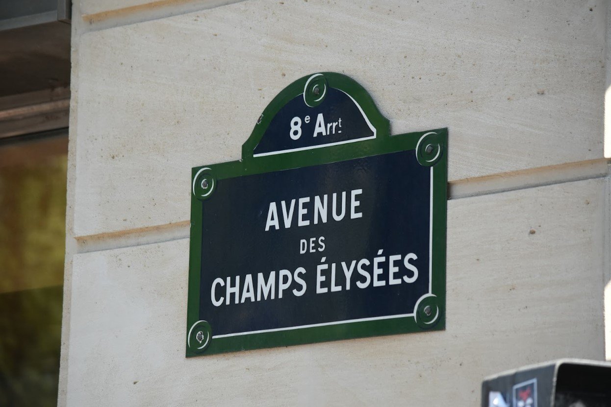
Source: Antoine Demare/Unsplash
It’s certainly less eye-catching than the iconic golden McDonald’s signage, but it definitely blends much better with the sophisticated architecture of Paris.
Red Arches
Should you ever visit the McDonald’s in Rocklin, California, on Sunset Boulevard, you’ll also be met with unconventional signage. This time, the iconic logo is bright red.
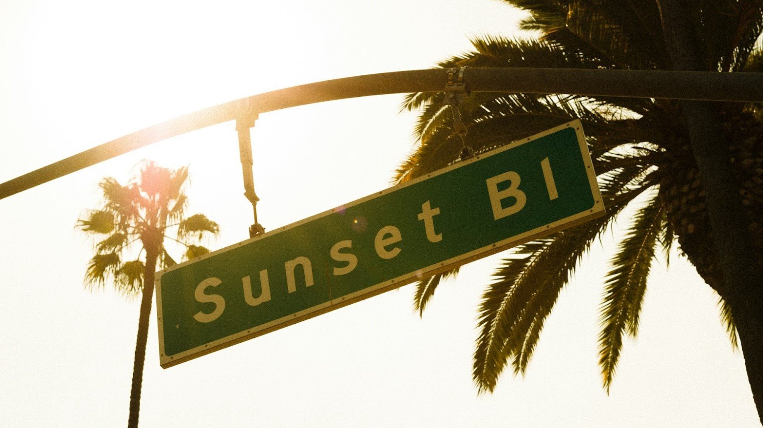
Source: Cedric Letsch/Unsplash
This is a little more in keeping with the overall McDonald’s aesthetic than other variations as it doesn’t stray far from the classic red and yellow McDonald’s motif.
Black Arches
Also in the state of California is another McDonald’s restaurant deviating from the norm and a different set of off-color arches.
Source: Brett Jordan/Unsplash
At a rather elegant-looking McDonald’s restaurant in Monterey, California, you’ll be greeted by a striking set of black arches adorning the building. This is in stark contrast to the traditional color associations customers have with the brand.
McDonald’s Iconic Arches
McDonald’s puts a lot of work into its branding and brand identity. It wants customers to make associations beyond simply the food. The sense of safety that comes from consistency is part of this.
Source: www.CGPGrey.com/Wikimedia Commons
So, any deviation from this consistency is noteworthy and definitely done with careful consideration. Ditching the “golden arches” in favor of a more subdued turquoise to preserve the natural beauty of the Arizona landscape is definitely an admirable move from the famous fast food brand.